Saturday, April 28, 2018

A Google Augmented Reality Expedition

Last year, Google embarked on Expeditions where they previewed their virtual reality experiences with their now signature cardboard viewers. This year, in a similar fashion, they are previewing augmented reality experiences. My school participated in one this week, so I thought I would share what it was and how it went.

First, to invite them to my school, I filled out this form with some general information. I knew Google was in my area at the time I requested the experience, so I probably lucked into the Expedition. Timing is, after all, everything. 

Google responded to my request with one of their own: respond to their invitation email with a complete schedule of teachers who would rotate into two rooms for the Expeditions over the course of a school day, leaving a one hour break for lunch. I invited anyone in my school to participate; a great cross-section of teachers responded positively. An art teacher, a French teacher, three science teachers, and a computer science teacher agreed to bring their students during our abbreviated testing schedule. A math teacher and our interactive media teacher wanted to come, but I couldn't work them into our schedule.

Imagine one of these dinosaurs in your classroom!

On the day of the visit, a representative arrived at our school. He quickly setup rooms for the Expeditions - 11 phones on selfie sticks for students to use, one similar setup for the teacher "guide" and QR codes on sheets of paper scattered throughout the room. The teachers came down for 30 minutes of training where they learned the ground rules and experienced the Expeditions.

Each of the QR codes triggers an augmented reality object from a set of objects in the Google app. There are many to choose from, some really amazing (Mars, dinosaurs, mitosis) and some not really worth exploring (periodic table), and they often match up with the virtual reality Expeditions to make a cohesive combination. The teacher uses the app to select the set of objects to be explored. The app seemed very easy to use - swipe through the objects and tap play for students to explore it. Teachers can also tap and hold a place on the object to create a spotlight that students can hunt for (to highlight something) or make the object really big (very cool for dinosaurs) or very small. Students can move all around the objects, zooming in by moving the viewing device closer to the object.
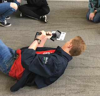
The students who participated were very engaged and enthusiastic about the experience for the most part. They eagerly explored objects, often sitting or kneeling or laying down on the floor to get a better look. They also called out what they would like to see from the extensive list of options. This experience came at the end of a week devoted to state testing and I think they were grateful for a completely different type of experience.

The form is still live for teachers to request the experience. I'd recommend trying it out for sure. Hopefully, these Expeditions will allow for fine-tuning of the app before this version is released for all. There is also a form available to volunteer to create augmented reality experiences. I'm really intrigued by this and am considering filling it out. I think there are many possible intriguing chemistry experiences that this app doesn't capture yet. The possibilities, though, for capturing things we can't see or interact with directly are amazing.

Want to learn more about it? Click here.

Monday, April 23, 2018

Science . . . the Write Way


Twice I have been honored to contribute to Larry Ferlazzo's Education Week column, Classroom Q&A. This tweet at the right announcing the most recent contribution is getting a bit of attention tonight, so I thought I could put together some references about science writing.

First, please visit and read Larry's column. He includes ideas from a variety of teachers so there will certainly be something of interest to all educators. This particular column addresses "ways to integrate writing into science classes" and features my ideas alongside Mary Tedrow, Maria Grant, and Diane Lapp. I also participated in Larry's BAM Radio Network program with Maria and Mary and you can listen to that program here.

I have written two posts to my blog about the way I incorporate writing into my chemistry classes with lab reports. I have twice modified testing rubrics so that my students receive regular practice at writing using a standardized test rubric to guide their practice. In this way, I can reinforce what they practice in English class and help prepare them for their state tests. If you could like to read my post about the modified PARCC rubric, click here. If you would like to read the post about my modified AIR rubric (Ohio test), click here. In both posts I share my actual rubrics. Feel free to use them if they suit your needs!

How are you integrating writing in science class? Please leave your ideas in the comments below.

Sunday, April 22, 2018

Screencasting . . . with iPad!

I can't believe that it took me this long to try screen recording on iPad, especially since it is my device of choice. Today I made my first screen recording and it was very easy.

First, I had to find the controls to screen record. Go into Settings and select Control Center. Then tap Customize Controls. You will find a list of things you can add to your Control Center. Tap the green + to the left of the Screen Recording icon.


Once you do this, it will appear in the list of things included in your Control Center.


That's all there is to it. Exit Settings. Open your Control Center. Tap the Screen Recording icon to begin recording. Demonstrate whatever you want to show on your iPad. Tap the Screen Recording icon again to stop.


If you try it and your first screencast doesn't have any sound, you have to enable the microphone. To do that, tap and hold the record button (pictured above). When you do, you will get a pop-up that allows you to turn the microphone on! Thanks to Ken Krott who commented on that below!

This would be great to model an app that you want students to use or show the features of an app they will explore. I am definitely going to start making use of the feature!

Saturday, April 21, 2018

Copying Images in Adobe Draw App

This year I am, again, participating in Sketch50. Last year when I did it, I started using Adobe Draw on my iPad and mostly I use my index finger as a stylus. I like Adobe Draw a lot because I can draw on different layers and then delete layers while I work. This is nice if I want to trace an image and then delete it. This week we drew sketchnotes about technology and today I wanted to weave all of my images together into a story. Rather than draw them a second time, I thought copying them from one project to another would be easiest, but I didn't know how to do that.

It turns out that it was very easy. Layers in Adobe Draw can be pasted into other projects. Basically, you grab the layer you want and click and drag it to the center of the canvas. Then close that one and open another, all while holding it, then let go when you're inside a new canvas. Then you can resize and move. I made a 1 minute video about the process you can watch:


I used this process to take my sketches from here:


and drop them into here:

Now that I know how to do this, I'm going to keep practicing so I don't forget! This definitely adds functionality to Adobe Draw for me because instead of drawing some images over and over, I can just grab them and move them into a new project. 

Are you sketchnoting? What apps do you use? What do you like about them?

Tuesday, April 17, 2018

Lightening up our Standards

Have you seen these light boxes around? I keep seeing them all over the place. From my view in the aisle of the store, I was feeling pretty "meh" about them until my daughter received one as a birthday gift. She was so excited to get one that it was one of the first things she opened. Now that I have seen it outside the box, I admit that I, too, am quite taken with it. And, as with so many things, I keep thinking of things I could do with it in my classroom.

One idea I had is to post my standards on it each day. A standard light box comes with a small set of letters - maybe two of each letter and a few extra of the vowels. That probably wouldn't be enough to write an entire standard. I got to thinking that I could type the standard in a large font size, print it, and use the copy machine to make a transparency. Then trim it to the right size and slide it into the tracks for daily viewing. I like the idea of this because it would emphasize the standard in a way that's fun. The light draws attention to it. I mentioned this idea to my daughter and she said she appreciates that her ELA teacher posts the "I Cans" every day and she thought the light box would be great for that.

Of course, the light box could have other classroom applications too. Maybe it could announce birthdays. Kids would get a kick out of that, I think. Maybe reminders could be posted. Or homework assignments. Or station directions. It's a little gimmicky, I guess, but I think these have a place in the classroom. Are you using one in your classroom? Do you have ideas for how you might use one?

It's almost Teacher Appreciation Day. A light box is on the top of my wish list. I'll let you know how I use it if I get one.

Wednesday, April 4, 2018

Two More Possible Padlet Replacements

Doug Robertson definitely wins the "best tweet of the day" for his suggested Padlet replacement: giant pad of paper and sticky notes. I love it!

There have been lots of other free suggestions today, like using Google Docs, Slides, or Drawings as a replacement. Everyone's fave Richard Byrne blogged about 5 Alternatives on Free Tech for Teachers today.

Still, I poked around and looked at two more possible Padlet replacements: Pearltrees and Stormboard.

Pearltrees

Pearltrees was not new to me, but I was prepared to hate it because in my previous use of this tool, I found it to be not intuitive. I am usually willing to give a tool 15 minutes. In that time, I either find value or decide it's not worth the time. I'm glad I took a fresh look at Pearltrees because within 15 minutes I could see teachers using this one. It's much different than I remembered it.

The interface is pretty simple. Click a plus sign and you can add a collection or an image, file, link, note, or import things from Drive, Dropbox, Facebook, Twitter, or your computer. Collaborators can be invited through email. Collections are embeddable. Here's the one I made:
You can also share your collections via link, through email, Facebook, Twitter, Google+, and by QR Code (nice touch for education!).

Pearltrees has a free and premium service with special packages for educators. The free package comes at a cost - all collections are public. For only $25/year, you can change the setting to private and get full customization.


Pearltrees has an iOS app, an Android app, and a web clipper Chrome extension or Firefox add-on that you can use to add things to your collections from anywhere on the web.

Stormboard

Stormboard was a new tool to me, so I was excited to try it out. I saw a few people recommend it on Twitter yesterday as a possible replacement. It's really designed to be an online brainstorming, collaboration tool, but could be used with students in a Padlet-y way, I suppose.

You start by creating a "storm," a board where you will post ideas and perhaps encourage others to do the same. They have ready-made templates that serve many purposes, including some education specific templates to help students write 5-paragraph essays or compare and contrast two topics. Once you name your storm and choose a template, you can click to add an idea in the form of text, a whiteboard, an image, a video, an index card, or a file. "Text" is a sticky note and I quickly mastered that. You can color code the sticky notes and create a legend for what each color represents. I struggled mightily to get the whiteboard to work (I managed a sad scribble eventually) and almost started cursing when I tried to delete my index card. Video and image were much easier. If I used the tool a lot, I'm sure I would get the hang of it, but I didn't find it to be intuitive. Here is an image of my final product:


You can share storms, and invite collaborators, via link and email. If they are embeddable, I did not find that option. When you are finished with a storm, you can close it, but they can never be deleted.

Pricing is a little tricky. There is a free Personal plan that gives a user 5 open storms with 5 collaborators each. For $60/year, the Startup account gives unlimited storms and collaborators. There is an Educator package also which allows for unlimited storms and collaborators with more storage and features; it is free until June 30, 2018. Not sure what happens after that date.


There is an iOS app, Android app, and Microsoft app, but I did not find a browser extension or add-on. That makes sense for what this tool is designed to do. It's more about brainstorming and not so much about curating.

Bottom line: For me, I would choose Pearltrees over Stormboard, but depending on what you need, they each have potential.

Tuesday, April 3, 2018

After Padlet, There's Wakelet!

Padlet users went into mourning today when the inevitable happened: Padlet become a lot less free. Beginning today, if you used Padlet, you received a message about how many more free walls you could create. If you create a Padlet account today, you can choose between a free account (3 free walls, ads, 10 MB file limit, and standard support) or a $99/year plan where you get unlimited walls and lots of bells and whistles.

In fairness, and before I suggest an alternative, I'll say a few things in Padlet's defense. First, if you want a tool to grow and stay awesome, that takes people and ideas and infrastructure and those things have a cost. The expression "there's no such thing as a free lunch" definitely applies here. Second, in the letter I got from Padlet, it implied that I could have a total of four free walls (based on my usage), but if I created four and wanted a fifth, I could delete one that I no longer use. This suggests that it's not that I can create three more, it's that I can have four total. Also, you can pay by the month. For only a month if you need it for a month. Finally, Padlet is providing some extras in the Padlet Basic (free forever) account like Search, Themes, and Premium Wallpapers.

Still, for many teachers, $99/year to use Padlet is too much to spend on one webtool, so people began looking for an alternative. My pal Sarah Rivera suggested Wakelet, so I investigated that tool tonight. Here is what I found out:

Wakelet is similar to Padlet in that you can curate items together into collections. In my experience Padlet looks more like a bulletin board and Wakelet doesn't necessarily look like that, but beyond the aesthetics, the idea is basically the same. In fact, you can choose among a couple of different views for your collections and there is a grid view that can give the illusion of a bulletin board. Ish. Take a look at a collection I built tonight (you can embed them!):


Wakelet Features You Will Like


Wakelet is free.

Click a button to create a collection. Click in the header to upload or choose a cover image. Same for background images. Click to add a link, something from Twitter, and image, or text. When you have your collection just as you like it, click Save or Publish. You can have a private, unlisted, or public collection and you can add collaborators by email.

There is a Wakelet iOS app, an Android app, a Chrome extension, Firefox add-on, and Safari extension.

You can import your collections from Storify (which is shutting down as of May 16) which is kind of a cool feature. I didn't use Storify all that much, but I went ahead and imported what I had there just to try it out.

In short, Wakelet is not a perfect substitute for Padlet, but it is free, easy to use, can be collaborative, is embeddable, and has many of the shortcut tools that Padlet offered. It's definitely worth a look!

PS I'll make a comparison chart at some point . . . after a few more alternatives emerge.