Wednesday, December 30, 2015

Visualizing a Balanced Equation


If I was going to make a list of the 5 things I would want any student to be able to do when they leave high school chemistry, I would certainly include balancing equations on that list. A balanced equation is a chemical sentence, the shorthand way we have of representing what substances combine and what they change into. The equation has to be balanced (coefficients are placed in front of symbols and formulas) to show that the process obeys the Law of Conservation of Mass (all the atoms from the beginning of the process must still be around at the end). In December my students learned to balance equations and by the test before vacation, they had mastered it.

In an effort to make all this invisible chemistry more visual, I routinely ask my students to draw atoms and molecules using a model of different sized and colored circles to represent different types of atoms. Sometimes I provide the pictures and they interpret them; other times I provide the chemistry and they illustrate. On the test I gave before vacation, I asked them to draw the particles involved in this equation:

2 Al + 3 CuCl2 --> 2 AlCl3 + 3 Cu

Here are some of the responses:

What the student below drew would be Al2 + Cu3Cl6 --> Al2Cl6 + Cu3. The equation balances. All of the atoms from the reactants are still present as products. The coefficients and subscripts are confused, though, showing a lack of understanding of what those numbers represent. I love that the student included a key!


What this next student drew would be represented as Al2 + Cu3Cl2 --> Al2Cl3 + Cu3. Again there is confusion between coefficients and subscripts, but, in addition, this answer shows a lack of understanding that the coefficient applies to everything in a formula that follows it. 3 CuCl2 would not be molecules made of 3 copper (Cu) atoms and 2 chlorine (Cl) atoms. Also mass is not conserved here; there are 7 reactant atoms but 8 product atoms.


Most of the students drew something that looked like this next picture (or the one at the top of this post). This is the correct representation.


At the beginning of this year, I wrote about a new take on notetaking (my most popular post ever) and my experiments with sketchnoting. This visualizing chemistry is sort of an outgrowth of that and some other things I have tried over the years. Most of my students could balance the above equation in fewer than 30 seconds, but some of them, despite showing the ability to balance cannot correctly interpret what the equation means. And that is something I would never have known except that I asked them to draw it.

If you are teaching chemistry, asking your students to draw some things might reveal some misconceptions too. If you are not teaching chemistry, what could you ask your students to draw to check for understanding?

Tuesday, December 29, 2015

Nature at its Finest

I recently spent more time, in a busy holiday season, than I care to admit playing with an app called Toca Nature. Toca Nature is one of 29 apps designed by TocaBoca, one of my favorite app makers. I think I grabbed it when it was free for 24 hours earlier this month and the cute fox icon was calling my name on Sunday morning when I should have been doing almost anything else. After just a few minutes, I was hooked.

Open the app and you find an almost blank canvas. There is a square landscape and some trees to get you started. Like all of TocaBoca's apps, the graphics are great. They have just the right mix of realism and fantasy, if that makes any sense. With some simple controls, you can add trees of 5 varieties or add mountains or water. Or, if you're that kind of person, use the hatchet to chop things down. With the trees come some animals. The animals need to eat, so you collect food too. Use a magnifier to zoom in and see the animals up close. If it sounds lovely, it is. If it sounds lame, just try it. I think you'll get hooked.


I like a lot of things about this app. First, it gives kids - even very small kids - an inkling about ecosystems. If you chop down all the trees, the animals disappear. If there are no fish for the foxes to eat, they start to look pretty sad. It isn't grim; there isn't death and destruction. But as my son chopped down trees and the animals vanished, we all understood what was happening.  Second, it offers a chance for discovery learning in a way that can't really be replicated by children in the world. While TocaBoca makes the point that this app isn't a substitute for actual nature, it is also really cool that you can make these big changes - create a forest, grow mountain range - and see what happens. Also, there are five animals that come with the 5 types of trees, but others are also possible and you have to figure out how to bring them around. Part of what had me hooked was trying to figure out how to "make" a wolf. Third, the animals adapt. Put a fox or a bear in the snowy mountains and see what happens. It's awesome. Finally, the simplicity of the controls and the groovy graphics really draw the player in and make it an engaging experience.


I like a lot of things about TocaBoca too. I like that they make the point that their apps are designed for open-ended fun that isn't competitive or designed for a specific gender or includes in-app purchases. I like that they post information about the importance of learning through play, that they take the position that digital toys and physical toys can be played in concert with one another, that balance is important. And I like that they are designing interesting apps that respect kids and offer them, in many cases, an experience that would be difficult to have in everyday life. Until Nature, my favorite TocaBoca app was TocaBuilders, a very cool maker-style app that I have called Minecraft without zombies, but the next one I want to try is TocaBlocks. It looks awesome too.

If you just bought an iPad for your family or your child, check out the suite of apps by TocaBoca and put Toca Nature on the top of your list.

Sunday, December 6, 2015

Create an Hour of Code this Week


This week is Computer Science Education Week. In conjunction with the week, and to encourage more people to try their hand at coding, Hadi Partovi and his army of friendly coders are encouraging us to create an Hour of Code. Two years ago this effort began and it grows every year. You don't need any experience to try your hand at some basic coding. The internet is crawling with easy activities and tutorials. In fact, Google's Made with Code has a fun Santa Tracker that is easy peazy. It won't take you an hour, but it might whet your appetite for more coding fun.


Two years ago I signed up to create an Hour of Code with my students. I blogged about it here. This year, like the previous two years, I will teach my students to write programs on their graphing calculators. I will lead them through one and let them create a second with only one requirement: the program must be used to solve a chemistry problem. I am always amazed at what they come up with. And how quickly they can do it after seeing just one program written.

If that sounds too high tech for you, try out one of these other resources:

  • Create stories, games, and animations with Scratch
There is something on this list for all ages, from about age 6 on. 

No one thinks that completing an Hour of Code with make someone an expert. But the idea that every student should have access to computer science education is a noble one. I have seen first hand in my classroom that, for some students, seeing that they can write a program is transformative. Spark someone's imagination this week by helping them create an Hour of Code. You'll be glad you did. And so will they.

Monday, November 30, 2015

Quiver with Excitement

Over a year ago, I wrote a post about a couple of things, including some augmented reality apps that I like. I also added an augmented reality page to my blog so I can stockpile resources for using AR in the classroom. One of the apps you will find in both places used to be called ColAR Mix. In the year since the post, the app has been renamed as Quiver. It remains one of my favorite AR apps to show people. Imagine my excitement to learn that they now also have a Quiver Education app.

Like the original ColAR Mix, er . . . Quiver, the app offers coloring pages that you can download online. The app brings them to life with the augmented reality experience and the objects dance around on the mobile device screen decorated in the way the artist colored them. My children, including my reluctant to color 12 year old, were happy to oblige me when I suggested we try out this new app. 

We tried out several pages - the world map, a create your own flag, a tetrahedron, the volcano, and the animal cell. The world map can be brought to life with or without border lines (shown here with border lines). The Earth spins as the colored portions are displayed. The flag flies on a pole and can be raised or lowered. Both of these also allow the user to explore traditional images of Earth and flags. 


The tetrahedron is one of several available platonic solids that can be virtually thrown like dice. Each time you throw it, you could get a different side. That could be a fun way to choose something in a classroom! 

The volcano and the cell have the 3D experience that users love about Quiver but they also contain an added bonus, a quiz. You can view the image as you colored it, but you can also be quizzed on parts of the volcano or the cell. The app asks you to identify a feature and gives you a selection of choices to tap. If you tap the wrong one, it shows the correct one. It is a fun way to check on progress.


As with the Quiver app, I love the incentive of coloring the page when you get to see the image come to life. Even without the quiz, the animal cell is so great because you can see it in three dimensions. As a science teacher who struggles to help students see 2D images and envision them in three dimensions, I love this. Another feature I like is a drawer that pops out to reveal a camera and video icon to make for easy recording. This is much easier to use that to hold the device still over a sheet of paper and try to simultaneously tap the home and sleep/wake buttons!


No mention of an app would be complete without the price. Quiver Education might seem pricey at first glance: $7.99. That price, though, gets you all the coloring pages that will be available without in-app purchases and is eligible for the volume purchasing program. For an app of this quality with a promise of future content, that price is a deal.

Thanks to the friends at Quiver Education for gifting the app to me. I appreciate the chance to use it and tell people about its awesome potential.

Saturday, November 14, 2015

Measure Progress with Two Great Rubric Tools

Lately I have been on a bit of a rubric rampage. I love rubrics for a lot of reasons. I think they make grading subjective work a lot easier. And they simultaneously help students differentiate between performance levels and work to improve. I like how creating a rubric really helps me think deeply about what I am expecting my students to know and be able to do and how I will determine the degree to which they can do it. I use a rubric for scoring the group work that my students do in the lab and another rubric for grading lab reports.

This week I worked for many hours on a rubric that our instructional coaches and administrators introduced to our staff for self-analysis of our station rotations. It took a lot of hours and talking for us to arrive at a good starting point, but I know I learned a lot in the process. Today I taught some Google PD at Lake Erie College and, as part of that, I found and experimented with a rubric add-on. Then later I tweeted about a rubric tool that is easy and fast to use. As long as I am thinking so much about rubrics this week, I felt like I should dedicate a post to them.


Orange Slice: Teacher Rubric

During the PD I led today, I described add-ons and gave some time to explore. While I was exploring add-ons, Orange Slice caught my eye. A quick read of the description and reviews and I installed it. I tried it out and liked it a bunch. After it's installed, open a Google Doc and then run the add-on. If you have a ready-made rubric (like my lab report rubric) you can use it or Orange Slice helps you create one from scratch. Decide on some basic options (performance levels, grading categories), follow the prompts in the add-on pane and you will quickly have a rubric that pastes itself into the document. Keep working in the add-on pane and you will click your way toward grading the document. As you click, the rubric is highlighted to show the score in each level and a grade posts at the top of the page. Voilà! It's awesome!


A couple other thoughts on this one. First, use Chrome. I tried it in Firefox and it sort of worked. But only sort of. Second, there is a teacher add-on and a student add-on. I didn't try the student add-on, but this one is for peer edits. Many of my colleagues shun peer editing for a variety of reasons, but if you do it, maybe the student add-on would be helpful. It allows kids to score student work but then be overridden by the teacher score.


Quick Rubric

Storyboard That is a very cool and super-customizable tool that has an infinite number of uses in a classroom. The wizards behind Storyboard That have created two other equally cool tools, Photos for Class and Quick Rubric. There are so many things to like about Quick Rubric that it's hard to know where to start, but one of the things I found most impressive was the amount of resources about rubrics that are found on their site. The resources include an introductory article about rubrics, tips to making a great rubric, and ways to use advanced formatting in rubrics with this tool. How cool is that that help is provided, that this tool is instructionally based with a little PD support? Click the giant orange button that says Create a Rubric and you are on your way. You start with a 3x3 rubric but it is easy to add rows and columns and move things around. Type in performance levels or stick with theirs (beginning, emerging, proficient) and criteria for grading. Typie in how many points the assignment is worth and the tool assigns point values to categories. Create an account to save your rubric or access rubrics you create.


Maybe part of the reason why some teachers don't use rubrics is that they can be time-consuming to create and apply. With these two great tools, those excuses are gone!

Wednesday, November 11, 2015

Provide Better Feedback with The Answer Pad

I can't go to bed tonight until I write about all the great things happening with The Answer Pad. As a TAP Champion, I sometimes get to preview some features of this excellent tool before they go live for everyone. Today the features that I will describe have gone live for everyone, so please check them out. You will be glad you did!

If you have read some of my other posts, you will know that I love this tool. The Answer Pad is two great services - one part student response system, one part digital answer sheet maker. Want to just ask some questions in class and see how well the students understand the lesson? The Answer Pad can help with that. Want to stop spending time grading tests? The Answer Pad can help with that too. With generous free features and very affordable premium features, this tool is one of the best values out there. This week a great tool got even better.

The newest feature is a feedback loop. Send a screen out to your students for feedback. I sent out a blank canvas and asked students to draw a molecule. Once the answers start rolling in, the teacher can provide some feedback. Colored dots (lower left in the picture above) can be sent out to the students to show them if they mastered the task, came close, or need another attempt. If they need another attempt, you can unlock individual student's work (lower right in the picture above) and send it back for another attempt. I previewed these features in class last week and one of my students said, "This was fun. Can we do another one?" Awesome!

Earlier this fall I took advantage of a different set of updates that work so nicely with this feedback tool. When students sign in, their names appear under the blue block that will contain their answers. There are two checkboxes above the student work that can take the tool to a new level when the work is projected. Uncheck the Show Names box and the student work becomes anonymous. Then students can see the answers of their peers, making for a great discussion of which are great and which need work. 


Don't want students to create an answer based on what they see? No problem. Simply uncheck the Show Answers box. When a student submits an answer, the class sees a little blue spy. Once all the answers are in, click the box to reveal everyone's answers at once.
The Answer Pad is a very easy and intuitive tool that requires little preparation or technical know-how to use and get great data and results. It works on all web-enabled devices and there are iOS and android apps. This week the tool got even better. If you want to try out something new in your classroom tomorrow, check this one out today!

Wednesday, November 4, 2015

More Buried Treasure in Keynote!

Last month I wrote about how there are some secret tools in Keynote. That was a great find. Last week I found some more. 

One of the features of iOS 9 I was most excited about was the ability to use two apps at once. When you are in an app, swipe left from the right side of the screen and a drawer opens. These are apps you can open in addition to the one you started in. It turns out that there are some limitations. You can't open just any app, just certain ones. It looks to me like the ones you can open in this reel are just the ones that are native to the iPad. That's a good start, but I hope more will be added.


Now to the Keynote treasure part: When you are presenting in Keynote on your iPad and you slide open this drawer, it doesn't get projected! So I can have a slide up - maybe my students are copying some notes before we talk about them or they are solving a problem - and open these other apps so that I can use Safari to take attendance or use the timer to keep us all on schedule. The students see the slide but I can open the second app and keep it hidden.


I would love to see other apps added to this reel of apps so that I could open Teachers Pick to choose a random student to solve the problem or open Chartkeeper to track student progress or a million other things. The possibilities are endless!

Friday, October 30, 2015

Using Paper and Pencil for Awesome Images

One of the things I am working on this school year is visual thinking - making my ideas more visible and asking my students to do the same. To that end, as a teacher, I will continue to focus on drawing tasks with my students and, as a learner, I am exploring sketchnoting. I blogged about that here.

The app that I am using for sketchnoting is Paper by Fifty Three. Paper is a sketching app with a recommended bluetooth stylus that allows for more functionality than a typical stylus. It is pretty easy to get started with Paper. And though I thought my first sketchnotes were pretty clunky, I got a lot of compliments on them when I shared them.

Those first sketchnotes were a bit of a struggle. The empty white canvas is threatening to me. I feel like I need a plan before I start and sometimes halfway in, I want to scrap the whole thing and start over. As I got started, I kept wishing that there was a way to import some images that I could compliment with drawing and text. Of course, it turns out that there is!

I recently learned that this is possible. In the app, there is a little camera icon in every sketch. Tap it and you access your camera (take a quick snapshot!) or your cameral roll (import a picture). After you have a picture, you can resize it or spotlight a portion of it. I used the spotlight feature to highlight only the colored flames in the image above. I love that this spotlight feature focuses attention on just the colored flame which is why I chose the image. Then I drew in boxes for answers and added a little text to create the image above that I could use to check for understanding after the flame test lab. Pretty cool, right? 

This is such an easy way to create a professional looking image that is customizable. Just one more reason to love this powerful app!

Monday, October 26, 2015

Get Wordwall, Indeed!

Last week I had a lot of good luck with new webtools. First I tried Quizalize and that was great. I also tried LearnClick (more on that at some point) and it was pretty good too. Then I finally got to WordWall's beta web version of their interactive whiteboard software. It was fantastic!

I first learned about WordWall on Danny Nicholson's excellent blog. I have had the tab open in several browsers for months. I wanted to use an activity created in SMART Notebook, but it wasn't working well with my new Epson projector, so I needed a substitute. It was a perfect time to try out the beta WordWall.

WordWall wants to keep teachers using "large touch screens" to "to create activities that are a pleasure to teach with, and fun to participate in." The WordWall concept is to create templates for teachers to use to create interactive activities. These templates are designed by graphic artists and are easy to use so teachers can focus on content and not on design. They have desktop software and, in fact, offer a free personal license to teachers, but now there is also a web-based version that is in beta. This is what I tried last week.

There are 34 templates in the beta version of WordWall. Some are teaching tools (seating chart, brainstorming) and some are games (whack-a-mole, group sort) and some are quizzish (true or false, quiz). Click on the template, type in your content, click done. It's that easy. You make an activity public or private and you can always come back and edit it later. Here is the activity I made. Students sort properties of ionic and molecular compounds.


To play, just share the weblink. The activity I made has a pleasant sound if you sort correctly and a sad noise when the property is in the wrong place. When all the tiles are placed correctly, they dance and there is a jingly sound effect. This is designed to be a whole group activity, but I am going to use it as a station in a station rotation I am doing on molecular compounds. I love the sound effects because students will get feedback about whether their answers are right or wrong independently, allowing me to concentrate on helping at a different station.

As promised, the activity does look great and you can change the look with the click of a button. It is also easy to change from one game type to another. I got a little stuck when trying to play (user error!), so I sent an email to the contact address. I got a helpful response very quickly - always a plus (Thanks, Dan!). There are some math tools available for equations and subscripts/superscripts. You can also search other user's games by education level and subject area, so you might find a ready-made tool just waiting for you. All in all, this is a great webtool and will definitely become one of my go-to tools! I highly recommend you getwordwall this week! If you want try out the beta, click here and use the code danbeta. Thanks WordWall for sharing that code with us!

Wednesday, October 21, 2015

Will you Quizalize your Class Progress?

One of my most popular posts is this one, a comparison of Kahoot!, Socrative, and Quizizz, three great formative assessment tools. Each of them has a quizzing feature with some gaming elements that make learning fast-paced and fun. This week I tried Quizalize, another formative assessment tool that will give them some competition with some of their best features plus some extras. 

I learned of Quizalize when they followed me on Twitter (thanks, Quizalize, btw!). Intrigued, I headed to the site to check it out. It was very easy to make a new quiz. Click the + New Quiz button and you're on your way. Add multiple choice questions with a few features -- a range in timing from 5 to 60 seconds, images, math mode (for math symbols and equations), and an explanation of why the correct answer is correct. I used the math mode so I could insert superscripts. I did have to read their excellent guide on how to make that work, but I felt like I learned something in the process.


After I created the quiz, I created my classes. Each class gets a code. When students play, they type in their names and the code and they get funneled into your class without creating an account. I love that! Then you can assign the quiz to the class and leave it open. This is one of the features I like the best. I created the quiz and assigned it on Monday, but my students didn't know anything about it or use it until Tuesday. This makes Quizalize great for a station in a rotation that might span a couple of days or as a homework assignment. With a click of some buttons, you can assign and unassign quizzes.

Now the fun part. The quiz assigns more points for right answers that are selected fast. Students earn a score that they see after every question. 
There did not appear to be a leaderboard for students to see, but the teacher can see everyone's scores as the quiz is happening and at the end. As the students play, the teacher can see a bar showing their progress, color-coded to indicate how well it's going (blue is great, red is bad). I removed the names for these screenshots, but they are displayed in the tool.

When the quiz is over, students can review their answers, correct answers and how long it took them to answer. 


Teachers can see the kind of data you would expect, but in some very cool formats. First, a graphic shows how many students participated and, based on the student shading, how well they did (of the 17 that "played" in one of my classes, one is rated as needing help and 6 were just ok). 

Teachers can look at individual questions to see which were hardest and easiest and what answers were selected. Click on a student and the teacher can see the student's strengths and areas of need. This is awesome and really sets this tool apart from some of the others. The data analysis available on Quizalize (visualize student progress with quizzes?) is excellent.


A few other things are noteworthy features of Quizalize. First, quizzes can be easily shared and made public. In addition, there is a marketplace where teachers can search for (and sometimes buy) quizzes to use with their classes. Teachers can, as far as I can tell, actually set their price and sell their quizzes (an aside: let's just share our stuff for free). I shared my first quiz with a colleague so he could use it too. When he tried, there was a problem, but a quick live chat with the Quizalize wizards had it working by his next class. That's fantastic.

I tried three new tools this week and this one was my favorite. If you are looking for a fun tool for formative assessment that is easy to use and gives you great data on your students' progress, watch this video on Quizalize and then head over there to get started.


Friday, October 16, 2015

Apps for Presenting from your iPad

This week a reader commented on this post about my use of my iPad to lecture in my classroom. He asked what apps I was using to project to the class. Below is a picture of a handout I used to suggest some options to my colleagues:


Of all the options on the page, IPEVO Whiteboard is the one I have used the most. It has just the right amount of great features combined with intuitive simplicity to make it easy to use. Yesterday I wrote about using iPad Keynote as a remote control for laptop Keynote. DeMobo Slides does pretty much the same thing with Google Slides and Prezi. If you have a laptop or iPad and a projector, one of the above apps will probably meet your needs.

Thursday, October 15, 2015

Finding Buried Treasure in Keynote

 Today, while prepping an activity for Monday with a colleague, we accidentally discovered awesome. He was using the iPad to tap through slides in a Keynote I made and he tapped too long on one slide. From the bottom of the screen popped up some hidden tools - 7 colored markers and a laser pointer tool. I know this isn't like discovering Teflon - and maybe everyone knows about this but me - but I was still pretty excited to find these hidden treasures. Once the tools pop up, you can select a color and write on the screen to highlight an idea or draw something onto an image. Tap the laser pointer and you can drag it around to emphasize or draw attention to something.

I have written this year about using my iPad as part of my classroom routine for giving notes. I have been using an app called IPEVO Whiteboard for this. It has just the right amount of bells and whistles for me, including the ability to import images and record the screen while talking and writing. Yesterday I presented an iPad PD session and some of my colleagues asked for an easy way to draw on a slide. A screenshot and IPEVO Whiteboard is pretty easy, but if you already have a Keynote (or a PowerPoint you turn into a Keynote), these hidden tools are even easier.

So tonight I opened Keynote on my MacBook to see if these tools are available in the desktop version of Keynote. They're not. At least not exactly. What I learned tonight (thanks Keynote Help!) is that you can use your iPad or iPhone as a remote to control a presentation on your laptop or desktop Keynotes. When you use your iPad (or iPhone) as a remote, then you can use the highlight and laser pointer tools on your iPad and they will write on the slides on your desktop version.

It was very easy to set up my iPad to control my laptop version of Keynote. On the iPad in Keynote, I went to the Presentations screen and tapped the iPad icon. Then I tapped continue. Then I went into Keynote on the laptop and opened Preferences. I clicked on the Remote tab, clicked Enable, and selected my iPad. Then I could see a giant green play button on the iPad. When I clicked it, it started my presentation.

I'm not really a prepared slides kind of a teacher. I typically like to start with a blank canvas, but if I have a lot of images to share and annotate, I would definitely use this. Finding it today felt like discovering buried treasure!

Monday, October 12, 2015

The Blended Learning IN Your Lesson

In my most recent post, I mentioned the Straight A Fund Grant that my school received to renovate 60+ classrooms, our media center and lecture halls, and build a professional development center. Our grant evaluators spent a few days at the school this month. They attended a faculty meeting to touch base with our staff about how the blended learning initiative was progressing. They summarized for us what they had learned about our students' hopes for the pilot in meetings with the students. Students expressed a desire for:
  • increased availability of Information
  • greater Interest in content
  • deeper Interaction with teachers and content
These three points struck a chord with me. They aren't new ideas, but they are important ones. As this year gets off the ground, my colleagues and I are trying a lot of new things to use our available technology as much as possible. It is helpful, though, to have a litmus test to use for determining whether or not a use of technology will benefit teaching and learning. Perhaps these three ideas - information, interest, and interaction - can serve as the litmus test.
  • Will this use of technology bring students in contact with more or better information?
  • Will this use of technology establish more interest in the content?
  • Will this use of technology allow students and teachers to interact in a deeper way?
In the same way that the SAMR model encourages us to think about how technology complements or extends a lesson, these questions focus attention on whether or not technology enhances or distracts in a lesson. An internet search could bring better information or it could provide so much information that it's easy to avoid a task. A technology-based assessment could provide real-time data that informs instruction or it could be machine-graded with little impact on instruction at all. I like the simplicity of these three ideas as a lens for examining best practices. If the use of technology won't accomplish at least one of these things, I am going to try something else.

Monday, October 5, 2015

Staying Flexible for Blended Learning

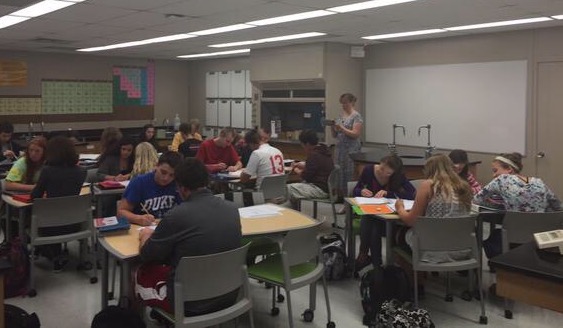
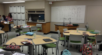
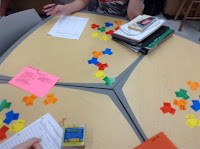
The school where I teach won a large grant last year to move ahead a vision of blended learning. The result has been a 1:1 program in the high school with 60+ redecorated classrooms, a new media center, and renovated lecture halls. The science rooms were limited a bit because we have a lot of specialized lab furniture that couldn't be changed. Still, our student desks - the classic desk attached to chair - were going away and we had to choose a new style of student seating. My room is especially crowded and I worried about adding a lot of tables to a space that already contained 7 lab tables and a teacher demonstration desk. In the end I chose tables where three trapezoidish tables form a wonky shield table. Six weeks in, I love them!

So far, I have used the tables in three arrangements. For everyday use - notes, group work, some stations work - I am using the trapezoidy tables in pairs. They create strange rectangle workspaces that are big enough for four students. When I need a bigger space for bigger group activities or larger station work, I move three smaller tables to form the wonky shield. Sometimes I need the students to be independent - test and quiz day - and then I split all the tables apart and seat the students at those 12 tables and the lab tables.

I will admit that I spent a fair amount of time mocking the idea of flexible furniture last year. Of all the things I could augment or innovate in my classroom, I would not have bet that furniture would have made a difference. Like so many things I have tried in the last 5 years, I am eating my words this year. Now I am spending a fair amount of time moving furniture, but each time I do it, it goes a little faster. Plus, it's all on wheels so it is easy to rearrange to new configurations.

I am surprised at how much I like teaching students at tables. The biggest difference I notice is that the students interact much more when they spend every day facing each other in these groupings. This has meant that I need to be moving around a lot more; I don't really feel like I can stand at the board when I give notes anymore. I typically now stand right in the middle of the classroom and lecture off my iPad. On that side of the teacher desk, I notice more things about my students, like who is playing with their split ends instead of attempting chemistry and who is hungry for the next math problem. My students already worked in groups a bunch, but almost always at the lab tables. These new tables make their group work possible in and out of the lab space and reinforce my priority on teams. The students do rely on each other more, asking questions of each other as they work. Last week when I was checking homework, one lab group was working so hard to help one member with his homework questions. The level of intervention they were providing never would have happened when the desks were in rows.

Sunday, September 27, 2015

A Blended Approach to Vocabulary

My school is focusing on vocabulary instruction this year with the hope of increasing academic gains in several areas. To that end, I was asked to design an inservice with one of my colleagues for our staff to show how we could use blended learning tools to discretely teach vocabulary this year. Because my standard vocabulary approach had been to merely tell my students the meaning of a word and then keep teaching, I was surprised to be asked to lead this one. Still, I viewed it as a chance to learn something new and dove in. Last week completed the seventh session of this professional development that included an introduction to vocabulary instruction, a station rotation of Marzano strategies, and vocabulary centers.


Our first portion of the inservice introduced the idea of tiered vocabulary. We used Pear Deck to acquaint our peers with Tier 1, 2, and 3 vocabulary words. Tier 1 words are words the students come to us knowing. Tier 3 words are the content-specific words we already teach. Tier 2 words are powerful tweeners, the words that cross curricula, have multiple meanings, and provide a specificity in meaning. Our hope is that teachers will focus more of Tier 2 words this year.

The second segment of our inservice was a station rotation where each participant was assigned a challenging word (pulchritude does not sound like what it means!) and then worked through a set of Marzano strategies to learn that word and many others. On slides, we wrote friendly definitions, chose images, wrote synonyms and antonyms, and had a conversation with these words. Then all the words we presented by participants. We finished with a game. For our game, we used Speed Match by SuperTeacherTools. Want to try your hand at this game or just see what speed match is? Check it out here. It was VERY easy to create!

 Our third portion of the inservice allowed our colleagues a lot of flexibility in path, pace, and place as they explored our vocabulary centers. With ten different vocabulary tools at the centers, everyone had the opportunity to explore many strategies or focus on one in great detail. Overall, our inservice was well-received and our peers reported that they left with many ideas about what and how to teach vocabulary this year. Many people worried, though, that adding vocabulary instruction could take too much time, or at least take time away from something else.

In the category of "practice what you preach," I wanted to raise my vocabulary instruction without sacrificing too much time. Because I had never really done any vocabulary instruction before now, I acknowledge that anything would be better than my status quo. When it was time to review my first unit, I used a quick strategy to highlight some Tier 2 words from introductory chemistry. My students, working in pairs, were assigned a Tier 2 word. They had to write a sentence that showed how the word was used in chemistry, write a sentence that showed how the word might be used outside of chemistry, and then explain a similarity between the two sentences. They did this with dry erase markers on the glass walls in our media center. When they finished, they gallery walked the room and read all the sentences, putting stars next to the ones that they liked the best. Some of my favorites were the sentences and explanations of words like "element," "compound," "composition," and "uniform." The whole activity, from start to finish, took about ten minutes and I will definitely use this one again.

Tuesday, September 15, 2015

Drawing on Differentiation


Last year I did a lot of writing about asking students to draw models of particles to demonstrate their understanding of chemical concepts. I started this about ten years ago with my PLC and I always gain insight into my students' ideas when I look at their drawings. Drawing has become a regular part of my chemistry class and is incorporated on almost every test.

To that end, last week my students read about the classification of matter (elements, compounds, and mixtures). The next day in class they took an open-note quiz. I provided particle pictures and they had to answer questions about the pictures, like "Which one represents a mixture of two elements?" and so on. I have done something similar in past years as a check of their reading comprehension. What follows has been a guided notes activity and some demonstrations for extra emphasis. This year, instead, I split the students into three groups based on their quiz scores and provided differentiated learning experiences.

Group 1 had scores that were 60% or lower. These students completed the guided notes activity on iPads. Students tapped their way through a Keynote presentation and answered questions about particle pictures as they viewed. When they finished, they had a quick model building exercise where they filled small cups with models to represent samples of matter. When the cups were assembled, I checked the cups visually and corrected misconceptions.

Group 2 played a great game called TriConnect by Scienterrific Games. In this domino-esque game, cards are distributed evenly among players and have to be matched in turn by properties of a sample of matter. The students who played the game scored 70-80% on the quiz, so they were practicing what they knew and extending their knowledge with this game. The conversations as they played were excellent.

Group 3 performed an experiment. These students had demonstrated mastery on the quiz, so their work was an extension of our content. The lab was the chemistry standard of aluminum mixed with copper(II) chloride solution, but students were looking through the lens of a particle model of chemistry.

If someone would have told me a year ago that I would be managing three different simultaneous activities, where one was a lab involving chemicals, I would have balked, but the management piece was not as difficult as I imagined. The lab was short, so I had plenty of time to circulate among the three groups to offer help and clarification but also be vigilant as the chemicals were used. In the past, everyone had the guided notes whether they needed them or not. This year, students who showed they understood the content got to have a unique practice opportunity in the lab while students who were on the verge participated in a game to make practice more fun. For students who needed the guided notes, they were still available with the added model activity to check for understanding. The collaborative nature of the activities and groupings facilitated engaged, focused work.

The following day everyone worked in the lab, so every student still practiced these skills in the lab. In fact, the lab was due on the test review day and we had a lively discussion of particle models as we reviewed for the test. A quick look at yesterday's tests leads me to believe that the practice paid off, so I am looking for more ways to incorporate activities like these into my practice this year.